
Designing a more accessible discharge experience for older adults by connecting a simple hospital kiosk with clear, take-home guidance.
User Researcher, UX/UI Designer
Figma, User Flows, Service Blueprinting
Emergency-room discharge is a high-stress moment. Older patients may leave with complex instructions, unfamiliar medical terminology, and important follow-up tasks that are difficult to remember once they return home.
Create a discharge experience that reduces interaction friction, communicates urgent information clearly, and gives patients a format they can continue to use after leaving the hospital.
The project began with a simple question: how can discharge information remain understandable after the patient leaves the hospital? Rather than treating the kiosk as the final destination, I designed the experience as a bridge between the emergency room and recovery at home.
Avoid unnecessary typing, passwords, and dense navigation. The interaction should feel familiar and require as few decisions as possible.
Important symptoms and next steps need to be recognizable at a glance, especially when the patient is tired, stressed, or in pain.
A digital interface alone does not work equally well for every older adult, so the system needs flexible ways to receive and revisit information.
Discharge support should continue after the patient leaves the hospital, not end when they walk away from the kiosk.
Instead of asking patients to create accounts or type credentials, the kiosk uses information they already carry with them. This removes a major point of friction at the beginning of the experience.
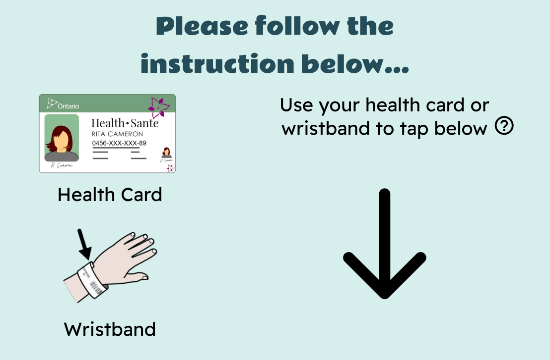
Patients can tap their hospital wristband or Ontario Health Card instead of typing a username, password, or lengthy identifying information.
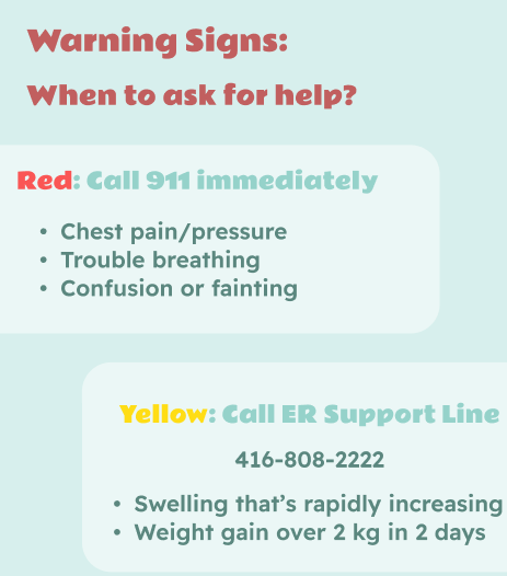
Instead of presenting warning signs as one dense block of instructions, the interface separates them by urgency. A traffic-light structure helps patients distinguish immediate emergencies from symptoms that require follow-up, making the next action easier to identify.
The kiosk is designed as part of a larger service rather than a digital-only endpoint. Patients can choose a physical booklet or another delivery method so important instructions remain available after discharge.
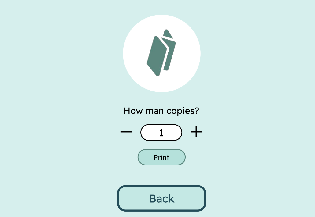
The system can generate a clear, easy-to-reference booklet that patients can bring home and revisit during recovery.
The final concept combines low-friction identification, accessible interface hierarchy, simplified warning guidance, and flexible take-home delivery into one connected discharge experience.
The project reframes accessibility as more than large text or high-contrast screens. It also considers memory, stress, technology comfort, and what happens after the user leaves the interface.
Designing for healthcare means thinking beyond a single screen. A useful experience has to account for the environment, the user's emotional state, and the transition between digital and physical touchpoints.
The strongest next step would be usability testing with older adults and caregivers to validate readability, interaction comfort, and the usefulness of each delivery option.